Component Library

UI Design
Project Overview
Led the migration of the design system from Adobe XD to Figma, rebuilding and organizing components to take advantage of Figma’s variants and style management. Focused on creating a scalable, well‑organized library to improve consistency and efficiency for the design team.
My Contributions
  • Evaluated Figma as a potential replacement for Adobe XD, addressing inefficiencies in prototyping with complex components
  • Created experimental prototypes and layouts in Figma to test component variants, style management, variables, and modes
  • Rebuilt and organized the component library using Figma’s variants feature for greater scalability and consistency
  • Implemented variables and modes to create reusable color tokens, enabling alignment with developer‑facing design system needs
  • Based the updated components on Atomic Design principles
Originally, our components were developed in Adobe XD, encompassing various states, styles, and interactions. This foundation enabled us to construct a more comprehensive library in Figma.
ConstructConnect
This project began with evaluating whether Figma could effectively replace Adobe XD for our design needs. Adobe XD had become increasingly inefficient for creating prototypes with complex components, hindering iteration and slowing our workflow. I explored Figma’s capabilities by creating experimental prototypes and layouts to test its support for component variants, style management, variables, and modes.

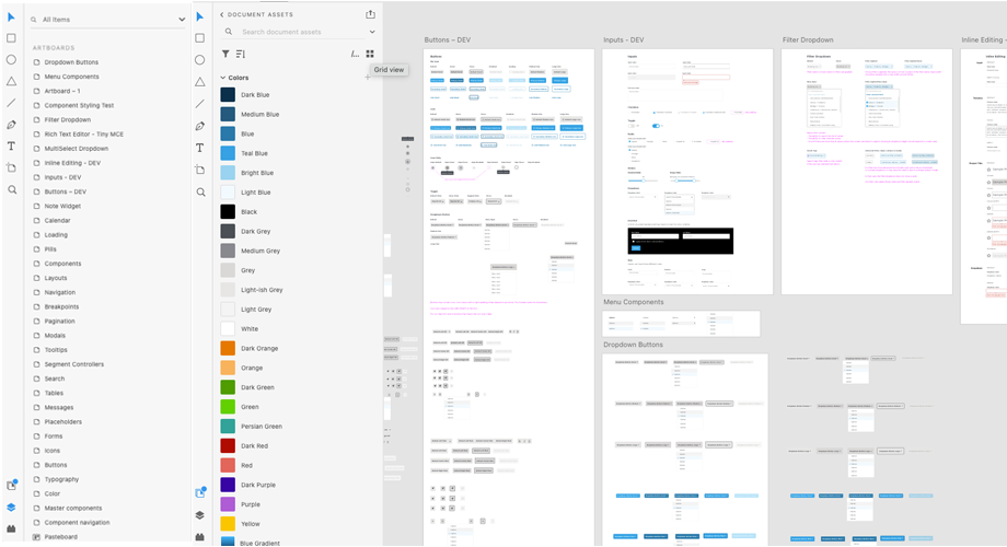
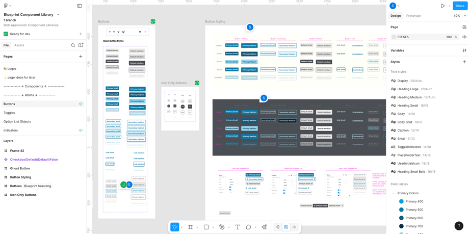
Once confirmed that Figma met our requirements, I led the migration of the design system from Adobe XD to Figma. In rebuilding the components, I applied Atomic Design principles by constructing each component in layers—from the smallest, indivisible elements (atoms) to combinations of elements (molecules), then more complex assemblies (organisms), up to templates and full pages.

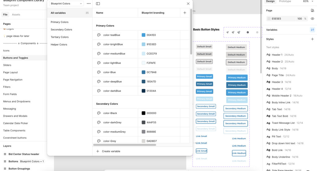
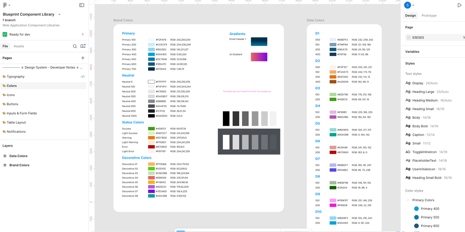
This methodology ensured components were built systematically for maximum modularity, reusability, and scalability rather than just reorganized. Leveraging Figma’s variants along with variables and modes, I created reusable color tokens and flexible component states, enabling a more maintainable and developer-friendly design system. The outcome was a streamlined, scalable library that facilitates faster prototyping, clearer developer handoff, and consistent design implementation across projects.
Adobe XD
Figma
In Figma, we are able to better organize our components and styles. The addition of variables has also helped us introduce color tokens for our components, which positions us to work better with our developers and creating a component library/design system for our various development teams.
Engaged in discussions with our Data Analysis team and concluded that establishing a distinct palette for data visualization is essential. This approach ensures that any updates to the company's branding colors will not inadvertently impact the appearance of charts and graphs.
UI Design
Migrated and rebuilt Adobe XD components to Figma
UX / UI Design
Boost user trust, improve clarity, and streamline payment process.
UX / UI Design
Updated to enhance security, usability, and streamline access
UX / UI Design
Updated the FieldCenter iPad app for better user alignment.