Payment Portal Redesign
ConstructConnect | UX / UI Design | User Journeys | Task Flows
Figma | Miro | Designed for Zuora Platform Implementation
Project Summary
Redesigned ConstructConnect's payment portal system, transforming fragmented, outdated workflows into a systematic, trustworthy payment framework. The old forms made users feel uneasy about entering payment information—the workflows were cumbersome, with missing validation and unclear guidance. This wasn't just reskinning—we fundamentally streamlined usability while building visual trust.
Catching an Incomplete Deliverable
When presented with a "finished" solution ready for deployment, I identified that we lacked workflow documentation for different payment types and contract variations. I pushed for additional discovery, working collaboratively with our lead UX designer and PM to understand the full problem space before proceeding.
Two Portal Types
- Payment Portal: 4 account-based workflows (Add Payment Method, Pay Quote - Renewal, Pay Quote - New Sale, Pay Invoice)
- Walkup Payment Portal: 2 touchless flows (New Purchase, Starter to Pro Upgrade)
Key Problems
- Outdated visual design created user hesitation
- Cumbersome workflows with unnecessary steps
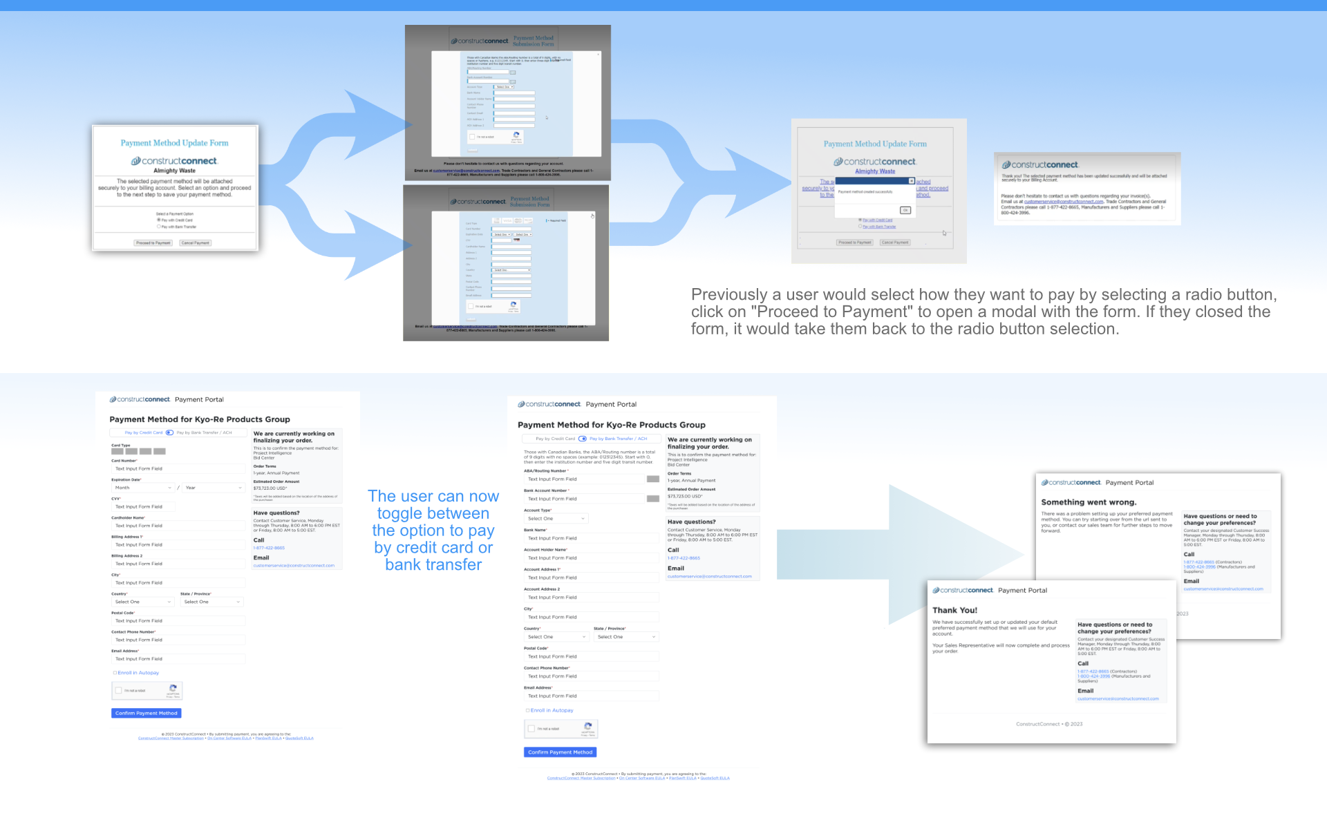
- Inefficient interaction patterns (e.g., radio button + modal vs. simple toggle)
- No systematic documentation
My Approach
Workflow Mapping: Partnered with UX designer to systematically document all workflows in Miro. This exercise uncovered inefficiencies that weren't obvious from isolated coded screens—functional but unnecessarily cumbersome paths.
Collaborative Design: UX designer led overall user journeys while I focused on detailed interaction patterns and visual design in Figma. Worked with developers to understand Zuora platform constraints for implementation.
Systematic Redesign
- Modern, professional visual design building trust
- Streamlined interaction patterns (toggle-based payment selection)
- Systematic validation preventing errors
- Clear error messages and recovery paths
- Consolidated redundant screens
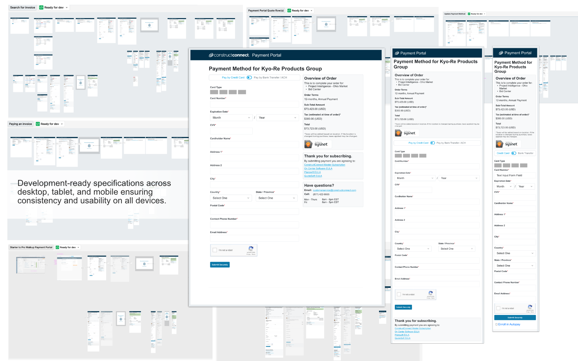
- Responsive design for desktop, tablet, mobile
The Solution
Created a cohesive design system serving both portal types with shared components and systematic patterns:
Shared Foundation
- Toggle-based payment method selection (credit card/ACH)
- Systematic validation and clear error handling
- Consistent branding and professional appearance
- Reusable components across all workflows
- Development-ready Figma specifications
Impact
- User Trust: Dramatically improved confidence through professional visual design, reducing payment anxiety
- Streamlined Usability: Systematic validation, efficient workflows, clear guidance, and reduced cognitive load
- Systematic Improvements: Consolidated workflows with reusable patterns, eliminated duplicate screens, consistent design language across both portal types
- Technical Success: Designed within Zuora platform constraints while maximizing usability, created development-ready specifications
Reflection
This project taught me the value of recognizing when systematic analysis is needed—even when stakeholders believe work is "complete." Reaching out to my UX partner for collaborative workflow mapping was critical. The exercise revealed that while the existing implementation was functional, it was unnecessarily cumbersome.This wasn't a reskinning project—it was comprehensive streamlining. For example, replacing radio button + modal interaction with a simple toggle reduced friction across all workflows. We improved both appearance and efficiency, addressing trust and usability together.Visual design and efficient workflows are inseparable in payment contexts—users need both confidence and clarity to complete high-stakes transactions successfully.


