Design System

ConstructConnect | UI Design | Design System | Components
Adobe XD | Figma | Claude AI
Design System Architecture Summary
Transformed a component library into a scalable enterprise design system serving multiple products through systematic token architecture, Atomic Design methodology, and design-development integration.
What I Did:
Led migration of ConstructConnect's design system from Adobe XD to Figma, introducing Atomic Design methodology and reorganizing 100+ design tokens from literal to semantic naming ("blue-primary" → "color/button/primary"). Achieved 98% token consistency and established Figma-Storybook integration framework, creating a scalable system serving multiple products with 95% component coverage where global updates now propagate automatically instead of requiring manual changes across files.

The Impact:
  • 98% token consistency achieved through systematic quality assurance
  • 100+ design tokens systematically organized with semantic naming
  • 95% component coverage with 25-30 composable components vs. 150+ specialized ones
  • Foundation for dark mode established without requiring component rebuilding
hero image of a design system in XD and Figma
Transforming a Component Collection into a Scalable System

The challenge:
Components existed in Adobe XD's library, but performance limitations forced designers to detach them to keep files functional. Once detached, components lost connection to the source, creating the same problems as having no library: designers maintained disconnected copies, updates required manual propagation, and consistency degraded over time.

It wasn't a design system.
It was a component museum.
My Approach
  • Tool evaluation and team migration (Adobe XD to Figma)
  • Competitive analysis validating architectural approach
  • Introduction of Atomic Design methodology
  • Token architecture redesign (literal to semantic naming)
  • Design-development integration framework (Figma + Storybook)
  • AI-assisted systematic quality assurance
The Impact
  • Global updates in minutes instead of days
  • Component reusability across multiple files/designs
  • Theming capability without rebuilding (dark mode foundation)
  • Design-development alignment through token translation
  • Systematic quality through AI-assisted review
image of two complementary proposals
The strategic foundation.
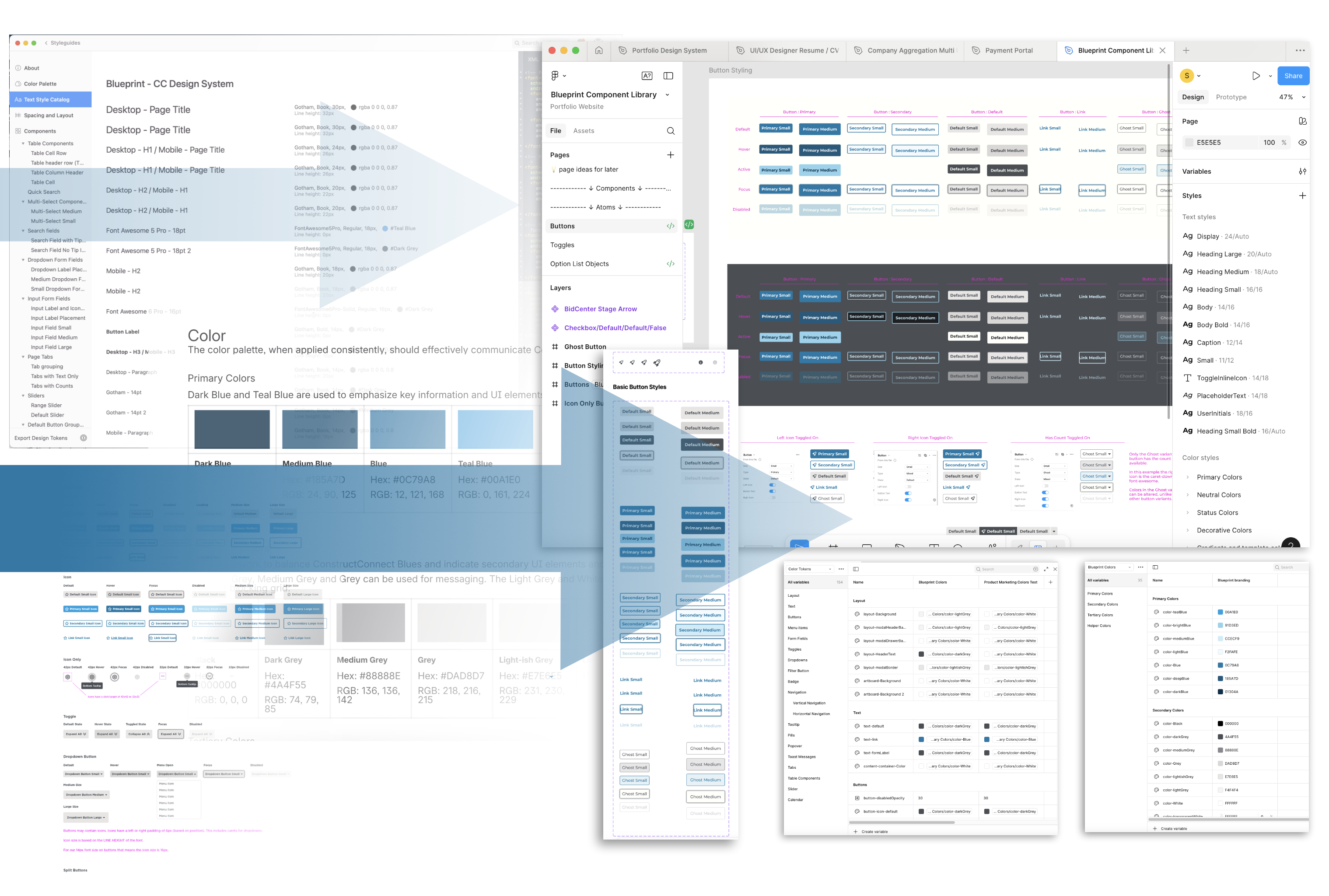
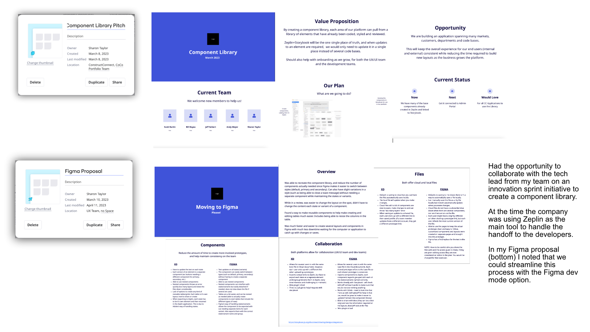
Through conversations with our tech lead about components being rebuilt across platforms, I volunteered to join an innovation sprint creating a systematic solution. This was a cross-functional team (Product, Design, Engineering) working within existing constraints—Zeplin as source of truth at the time.
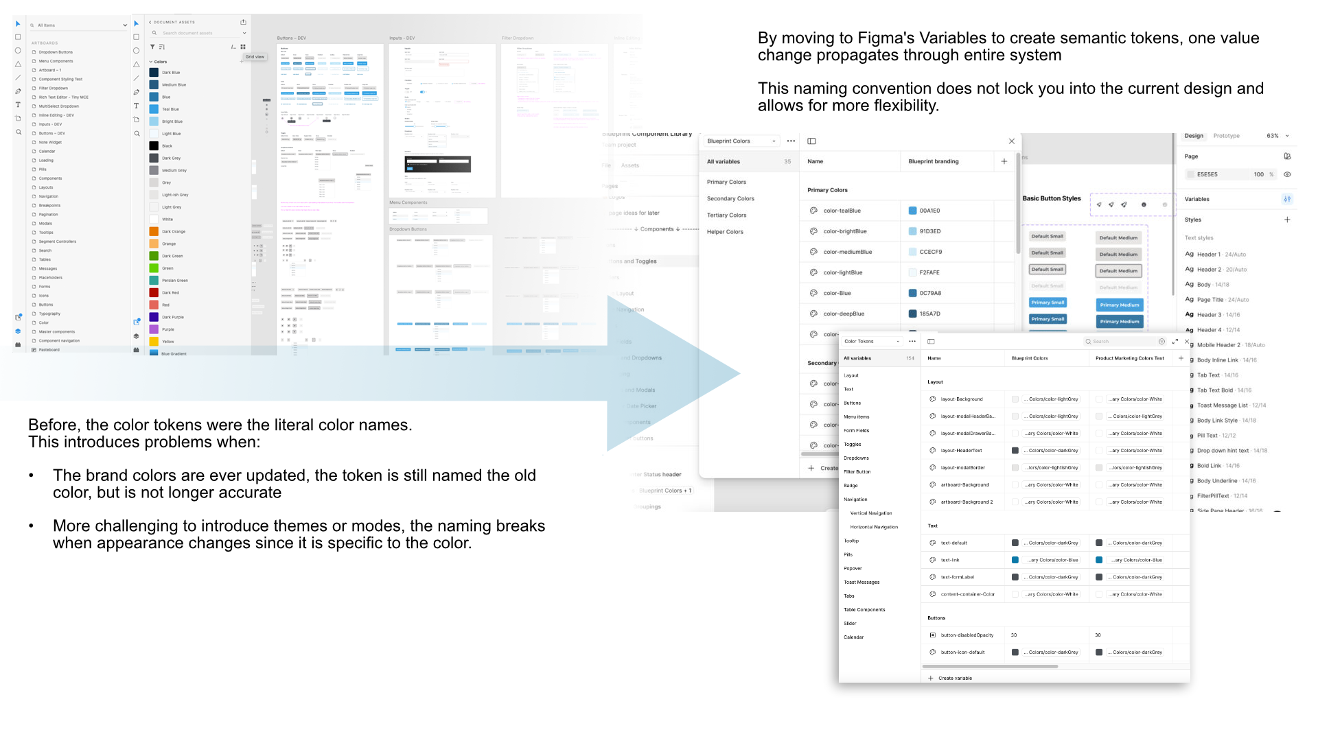
Through projects using Figma, it identified that we could streamline the process with better dev collaboration and direct Storybook integration, eliminating the Zeplin handoff step.
While the actual creation of the component library was temporarily postponed, I continued building the foundation that would eventually enable the vision we identified together.

They were not competing ideas.
They were complementary solutions.
Moving Forward
While the component library stalled, I kept building.

Foundation Built
  • Atomic Design component organization
  • Semantic token system (Figma variables)
  • AI-assisted quality workflow (Claude + Figma MCP)
Outcomes
  • Storybook integration-ready architecture
  • Global updates via token system
  • Dark mode foundation (no rebuilding required)
  • Design-code alignment through tokens
image showing movement from the old XD library to the Figma
Token Architecture Evolution
Literal token names ("color-Blue", "Dark Orange") broke when brand colors changed or theming was introduced.When a token is named "Blue" but the brand color changes to purple, the name becomes inaccurate. When trying to implement dark mode, what does "Dark Orange" even mean?The naming convention locked us into the current design and prevented flexible theming.

The solution was semantic tokens.
Tokens describe purpose, not appearance.
Semantic Token System
Purpose-based naming enabled systematic flexibility

Foundation Built
  • Token naming by purpose ("color/button/primary")
  • Figma variables for token organization
  • Theme-agnostic naming convention
Impact
  • One token change propagates automatically
  • Brand updates maintain naming accuracy
  • Future theming capability established

Reflection
This project transformed my understanding of what it means to build a design system. It's not about creating beautiful components—it's about architecting systematic relationships, enabling scalability, and reducing long-term maintenance burden.The most valuable skill I developed wasn't Figma proficiency or token implementation. It was systems thinking: seeing beyond individual components to understand how architectural decisions compound over time.Conducting competitive analysis, validating decisions with data, and using AI tools to accelerate strategic thinking taught me that senior design work isn't about execution speed—it's about making choices that serve business needs at scale.

The difference between a component collection and a design system is architecture.
I'm proud to have built the latter.
Scalable component library with Atomic Design
Legacy payment platform redesign
Mobile construction plan viewer